iosart.com | projects | articles | photos | about

Loop Commerce

November 17th, 2012

Excited to be starting Loop Commerce, my new venture. We are funded and already in full-throttle execution mode. Loop is based in Mountain View, CA and is hiring exceptional engineers to join our team and family.

If you’re a developer and are passionate about joining the core team and taking a key part of building a beautiful, reliable and scalable platform and product, please reach out. If you can think of awesome developers who are up for an exciting new challenge, please send them our way.

Check out our evolving jobs page at www.loopcommerce.com.

ColorZilla for Chrome is here

January 12th, 2012

ColorZilla It’s been more than 7 years since the original ColorZilla for Firefox was released. It was one of the first Firefox add-ons available, to be more precise it was add-on number 271 (out of more than 350,000 add-ons available today). Also, ColorZilla was the first browser based color picker – for the first time it allowed web developers and designers the convenience of sampling and adjusting colors right within the browser, without the need to use any external applications. Over the years ColorZilla has become very popular with hundreds of thousands of web developers and designers using it every day. Thanks to everyone in the awesome ColorZilla community for suggesting features, reporting bugs and supporting the product from the very beginning.

Today, after a quite some time spent in development, testing and refinement ColorZilla for Google Chrome is finally out. It has all the most popular features you came to expect from ColorZilla, and great care has been taken to adapt the user experience specifically for Chrome.

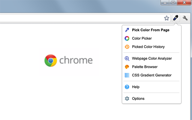
For example, because picking colors from web pages is one of the most used features, it was very important for this functionality to be as easy to trigger as possible. So, on Windows when you click on the main ColorZilla toolbar button you’ll immediately be in color picking mode. On MacOSX and Linux all you need to do is choose the first menu item (the closest one to the main button).

Also, ColorZilla for Chrome allows you to pick colors from Flash objects and at any zoom level (which you can’t currently do with some of the other color picking extensions for Chrome).

Main ColorZilla Menu

Main Features

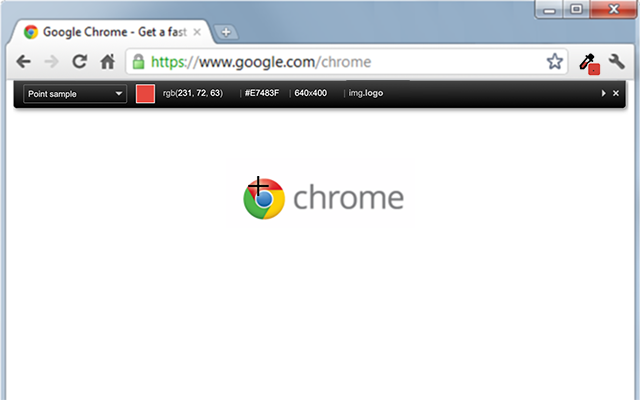
  • Eyedropper – get the color of any pixel on the page
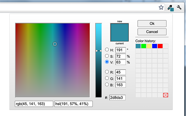
  • An advanced Color Picker similar to ones that can be found in Photoshop and Paint Shop Pro
  • Webpage Color Analyzer – analyze DOM element colors on any Web page, locate corresponding elements
  • Ultimate CSS Gradient Generator
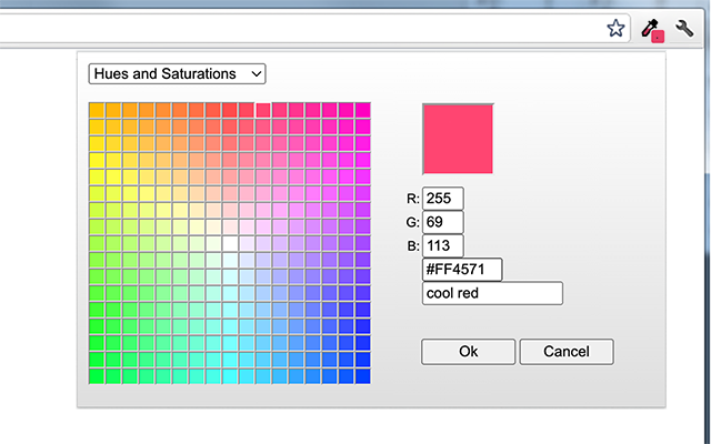
  • Palette Viewer with 7 pre-installed palettes
  • Color History of recently picked colors

ColorZilla Eyedropper

Additional features

  • Displays element information like tag name, class, id, size etc.
  • Outline elements under the cursor
  • Auto copy the generated or sampled colors to the clipboard in CSS RGB, Hex and other formats.
  • Keyboard shortcuts for quickly sampling page colors using the keyboard.
  • Get the color of dynamic elements (hovered links etc.) by resampling the last sampled pixel

ColorZilla Color Picker

ColorZilla Palette Viewer


So, check out ColorZilla for Chrome and let me know what you think.

StealMyLogin.com – exposing the dangers of insecure login forms

October 27th, 2010

This issue has been bugging me for a long time, and finally I decided to do something about it – check out StealMyLogin.com.

You might not be aware of this, but many of the biggest sites on the web implemented their login forms incorrectly, and this potentially allows malicious attackers to steal your login information, which could then lead to them stealing your social security numbers, bank information or your identity.

Among sites that have this security problem are Twitter, Facebook, AT&T, Netflix, GoDaddy, Progressive, Tivo and UPS.

StealMylLogin.com has the full story, background and technical details.

New color tool – Ultimate CSS Gradient Generator

September 28th, 2010

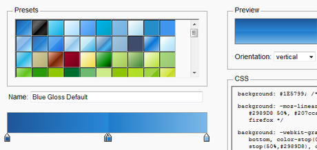
Just released the Ultimate CSS Gradient Generator – it’s a powerful online Photoshop-like CSS gradient editor that will output cross-browser HTML5 / CSS3 gradients and will complement the ColorZilla set of color tools.

As you might know, HTML5 introduced many exciting features for Web developers. One of the features is the ability to specify gradients using pure CSS3, without having to create any images and use them as repeating backgrounds for gradient effects.

A few features in this first version of Ultimate CSS Gradient Generator:

  • A convenient ‘presets’ panel for pre-selecting a wide variety of gradients.
  • A gradient editor control that allows adding and removing stops, changing their color and position etc.
  • ‘Preview’ panel allows previewing the current gradient as a vertical or horizontal one, and also allows quickly previewing how the Internet Explorer fallback gradient will look in IE.
  • ‘CSS’ panel always has the CSS for the current gradient for easy copying and pasting into your stylesheet.

Check it out and let me know what you think :)

Important: You’ll need a recent version of Firefox, Chrome or Safari to use this Gradient Generator. The resulting CSS gradients are cross-browser – they will work in these browsers and will also fall back to a simpler gradient in Internet Explorer.

The CSS Gradient Generator will also be included in the latest version of ColorZilla.


Credits: The ‘Ultimate Web 2.0 Gradients’ preset gradients were derived from the great work by deziner folio and SGlider12 (their work was released under Creative Commons Attribution-ShareAlike license). The Color Picker is a minor adaptation of John Dyer’s awesome Color Picker.

New version of ColorZilla – v2.5

September 12th, 2010

A new version of ColorZilla (v2.5) is now available. This version is still beta, so please let me know if you find any issues.

New in this version:

  • Color Picker Dialog:
    • New Photoshop-like ‘new/current’ color split panel
    • New smooth color map and color slider controls (based on John Dyer‘s JS Color Picker)
    • Experimental Lab and CMYK color spaces support
    • New ‘Eyedropper’ button allows sampling document colors while working in Color Picker
  • Eyedropper:

    • Limited Flash sampling support
    • Allow scrolling the document while color sampling
  • Web Color Analyzer: better color palette sorting
  • Firebug integration: fixed Firebug ‘Inspect’ panel opening for the last sampled element

By the way, if you missed the last v2.2 version, it added support for Ubuntu Linux 64bit, Firefox 4, HSL colors and more.

As always, you can download the latest v2.5 beta, along with the latest stable v2.2 version at colorzilla.com

Cool Flickriver video tutorial

February 26th, 2009

Just found this cool Flickriver video tutorial:

Thanks, gfurry! :)

Rippomania or how I’m digitizing my entire music collection

September 21st, 2008

I’m slowly but gradually moving my life to digital. I went from film to digital photography a few years ago and never looked back. Now’s the time to do the same with my music – I’m now in the process of ripping my entire music library and making it playable through out the house.

Having to go over hundreds of CDs each time I want to listen to a specific album can really take its toll on your music listening experience, so making all your music available at your fingertips anywhere in the house is great. Beyond that, the sound quality playing well-ripped lossless sound files with good equipment should be better than with any CD player. Basically, playing music with a CD player often introduces various artifacts (such as jitter etc.) – due to mechanical moving parts and lack of good error correction. On the other hand, because while ripping the CD the software can “double-check” that it’s getting a good copy, and re-read the original CD several times if needed, the end result is often better quality music playback.

Harpsichord

My CD ripping setup:

  1. Plextor Premium U external CD drive – this is an excellent drive for ripping music, especially because you can only use the Plextools (see below) with Plextor drives. These drives have long been discontinued, but you can still try and get one on eBay etc.
  2. Plextools software – excellent for ripping, if you have a Plextor drive. Similarly to EAC, this program allows you to rip your CDs without worrying that CD scratches or defects will produce a bad file. Basically, these programs perform some advanced verification and error correction algorithms to make sure the ripped data is exactly the same as the original one present on the disk. Make sure that you setup Plextools correctly so all of the advanced ripping algorithms I mentioned are turned on. Plextoor is reportedly faster than EAC, but both are really considered the industry standards for this sort of thing.
  3. FLAC – the lossless music format of choice, especially if you want bit-perfect copies of your music and widest possible support across various platforms. Plextools can rip to FLACs out of the box, which is great.
  4. Freedb – this service allows you to automatically get metadata about your CDs, so you don’t have to manually enter the names of your album, artist and the tracks for each ripped CD. Again, Plextool works with Freedb out of the box.
  5. MediaMonkey – an excellent media player, great for managing big music libraries. MediaMonkey has many useful features, but automatic tagging is probably one of the most useful ones. This allows you to automatically fix or complete the metadata of your songs and even find album covers.
  6. Sonos – multi-room digital music system. Basically, you setup all your music on one of your computers or a network storage device and then add a small box to any place in your home you’d like to have music at. Then you can have Sonos wirelessly play any music in your library at any location in your home, or have it synchronize all locations to play the same music. Sonos also comes with a very nice remote control to wirelessly drive the whole thing.

Guitar HeronoidSo, my ripping flow is as follows:

  1. Insert a CD, have Plextools pick it up and get the metadata from freedb
  2. Rip the CD, my file naming convention is “Artist\Album\Track # – Track name.flac”
  3. Use MediaMonkey to fix the metadata if needed, add album cover etc.
  4. Play the music on my machine with MediaMonkey, or throughout my home with Sonos
  5. Enjoy! :)

Sounds simple and easy, right? Not always. There are several problems you might encounter, some of them are:

  • Unicode problems, especially with non-English CDs
  • Damaged or scratched CDs
  • Missing or bad metadata, especially with classical CDs

I will post my solutions to these problems in the following posts.

For now, I’m off to listen to some music :)

ColorZilla v2 is here

January 7th, 2008

RGBIf you’re not familiar with ColorZilla, it’s a Firefox extension I wrote a while back to help me with my web design and development tasks. Over the years, it became quite popular with web developers and designers.

Anyway, over the course of this past year I added a few new features to ColorZilla (mainly because I needed them for my own work :) ), but because 2007 has been a very busy year for me, I just couldn’t find the time to properly test and release the new stuff to the public. Now, with Firefox 3 just around the corner, I finally took a bit of time to put everything together and release ColorZilla v2.

So, here’s what’s new in ColorZilla v2:

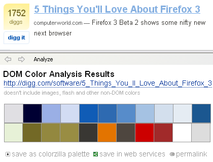
Webpage DOM Color Analyzer
Basically, this feature started with several simple questions – what colors are in use on any given Web page? What HTML elements use them and what CSS rules define those colors? So, Webpage DOM Color Analyzer analyzes a Web page and produces a palette of all the colors on that page. By hovering on any color, you can see what elements use that color, and by clicking on a color you can see a detailed listing of all the CSS rules that apply that color to DOM elements. You can even click on a CSS rule have ColorZilla open the corresponding style sheet file with the rule highlighted.

You can save the page colors as a ColorZilla palette, or open the palette in ColorZilla Online Viewer.

Webpage Color Analyzer

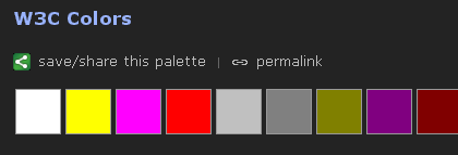
ColorZilla Online Palette Viewer
The online palette viewer is a simple webapp that can be used to view a color palette, bookmark it and share it using any number of bookmarking services such as del.icio.us, Google Bookmarks etc.

It works by providing a simple semantic URL that describes a set of colors:
http://colorzilla.com/colors/COLOR_1+COLOR_2...COLOR_N[/PALETTE_NAME]

Each color should be specified in a hex notation similarly to CSS, so for example red is FF0000 and yellow is FFFF00. The ‘palette name’ portion of the URL is optional.
Here’s an example of a palette URL:
http://colorzilla.com/colors/ff0000+00ff00+0000ff/Simple+RGB+Palette

Click here for an additional example.

When viewing palettes online, you get an online eyedropper (that works in all browsers!) that displays color information in many different formats for any color in the palette.

The online viewer can be opened from the ColorZilla Webpage Color Analyzer, or from the ColorZilla Palette Viewer dialog. The simple format of its URL also allows using it with any other application or Web service – all the application has to do is to generate a list of colors, append it to colozilla.com URL and launch that URL in a browser.

Online Viewer

Additional features

  1. Firefox 3 has a new Full Page Zoom functionality that allows viewing pages at any zoom level and handles both text and images very nicely. With Firefox 3 ColorZilla will use this new functionality for its internal zoomer.
  2. Firebug support – until now, ColorZilla allowed you to quickly open the selected element in Dom Inspector. Now, if you have Firebug installed, it will also allow you to quickly open it in Firebug.
  3. Ubuntu support was added. Basically, because Ubuntu’s Firefox was compiled using a slightly different compiler, ColorZilla eyedropper didn’t work unless you installed an official Firefox build from Mozilla. This version solves this problem by providing two versions of the eyedropper module, one built with the newer compiler (gcc4) and one with the older one.
  4. ColorZilla is now compatible with Firefox 3
  5. 3 new languages were added – Indonesian, Korean, Norwegian. Thanks to the BabelZilla team!

ColorZilla v2 (v1.9) is still in beta, but should be stable enough for everyone to try. Check it out and let me know what you think :)

PlainOldFavorites and FirefoxView for Firefox 3

December 29th, 2007

ColoreflectionsAs you might know, Firefox 3 will be released very soon, so I needed to go over my extensions, make sure they are compatible and make the necessary adjustments here and there.


I started with PlainOldFavorites and FirefoxView, here are the new versions:

PlainOldFavorites 1.0.1

  • Compatible with Firefox 3
  • Catalan, Czech, Danish, Greek, Portuguese translations – thanks to the BabelZilla team!

FirefoxView 1.0

  • Firefox 3 compatibility
  • 24 new translations: Catalan, Czech, Danish, German, Greek, Persian, Finnish, Galician, Gujarati, Hebrew, Croatian, Hungarian, Italian, Japanese, Korean, Dutch, Polish, Portuguese (Portugal), Russian, Slovak, Turkish, Ukrainian, Chinese (Simplified), Chinese (Traditional) – thanks to the BabelZilla team!
  • Graduates to version 1.0!

So, check the new versions out and let me know if you see any issues.

Also, stay tuned for the new version of ColorZilla coming soon – unlike its two siblings above, ColorZilla’s new version will be a bit more major 😉

OpenSocial and Facebook Platform side by side comparison

November 3rd, 2007

iPalmSurely, you’ve heard about Google’s new OpenSocial platform.

I believe this is indeed a very significant step forward, especially taking into account the launch partners who are already on board.

Naturally, a lot of comparisons between OpenSocial and Facebook Platform have been made, mostly having to do with the fact that Facebook Platform is closed and proprietary, and OpenSocial is open and standards based. While I couldn’t agree more, after reading the OpenSocial documentation carefully, I couldn’t help but notice that there’re several Facebook Platform features missing from OpenSocial – mainly having to do with app management, permissions etc. To try and make some sense of the differences, I created the following table, comparing the two platforms side by side.

Facebook Platform Open Social Notes
Universal + Facebook apps work only on Facebook, OpenSocial apps (will) work everywhere
Standards based + Facebook – FQL, FBML, OpenSocial – JavaScript, HTML
Extensible + OpenSocial allows certain containers to expose additional data to apps etc.
Publish user stories + + Both platforms allow posting user stories or activities
Get friends list + +
Get user info + +
Persistence + OpenSocial provides an integrated solution for storing app data
Send app notifications + Facebook allows apps to communicate with users via email
Send app requests + Facebook apps can send requests and invitations to non-app users
Spam controls + Facebook monitors and allows users to report spammy apps and takes appropriate actions
App permissions and privacy settings + Facebook provides fine-tuning of each app’s permissions and privacy settings
Access to events, groups, photos, marketplace +
Application directory +
App added notifications + Facebook notifies user’s friends when they add new apps
Additional container hooks + Facebook apps have icons on profile page, left sidebar links etc.
Dynamic profile box + Facebook uses push model with which user’s profile box needs to be explicitly updated by the app. OpenSocial allows fully dynamic profile boxes
Image caching + Facebook caches all 3rd party images. Pros – higher availability, cons – difficult to create dynamic images

Conclusions – first, OpenSocial is only at its 0.5 version, and I’m sure it will be significantly improved and extended in the near future. With that said, looking at the features side-by-side today, it’s clear that OpenSocial currently provides two basic functionalities – containment and access to container data. It doesn’t provide any of the higher level functionality present on Facebook – things like application directory, application permissions and privacy settings, spam controls, additional application links and hooks, ‘app addded’ news posts etc. Each container site will need to implement most if not all these functionalities independently, as they obviously address pretty common needs and problems. This also means that within each container there will be slightly (or maybe even significantly) different app virality, discovery and distribution dynamics.

Lawnmower

One thing is for sure – OpenSocial makes developers’ life much much easier. Unlike Facebook platform, OpenSocial doesn’t require learning new markup and query languages, and the specific platform quirks associated with many of the proprietary mechanisms. Also, with OpenSocial developers won’t have to work hard to figure out how to easily push updates to user profiles, or how to include dynamic images or initially interactive flash elements into the profile box. On the other hand, many of these restrictions were introduced by Facebook for a good reasons (at least in their opinion), and it would be really interesting to see how removing these restrictions will affect end-users’ experience.

I’m personally really looking forward to seeing what effect OpenSocial will have on the Web and how Google’s recent move will affect Facebook, Yahoo, Microsoft, AOL and other big players, and what will be their response. Exciting times!

4 simple tweaks for speeding up your website

September 13th, 2007

A stairway to...Donald Knuth once said that “premature optimization is the root of all evil”. Programmers often waste too much time optimizing their products for situations which will never actually happen in real life. The same is definitely true for web development – do you really need that sophisticated caching system if your site is being visited by 5 people a day?

With that said, you should always have scalability and performance in mind – know what steps you can take to improve performance if your site becomes popular.

If you have a scalable architecture, adding more servers and upgrading the existing ones should definitely solve many performance issues, but before you start buying more hardware, there are several simple things you can do to improve the performance of your existing system:

1. Minify your JavaScript files
Your JavaScript files often contain comments, white space and other unneeded characters. Minifying these files means removing these unneeded characters, which can reduce the size of your files by 5%-30%. Smaller files, faster transfers, better response times. A nice utility for minifying JavaScript files is JSMin.

2. Compress served content
Vast majority of modern web browsers supports compression, which means that your server can compress the document before it sends it to your browser, and the browser uncompresses it upon arrival. Compressing your HTML, JS and CSS content can dramatically reduce its size – by up to 70%! Again, smaller files mean better response times and happier users. The method for enabling this functionality really depends on your web server, but with Apache 2.x you can add something like the following to your .htaccess or httpd.conf files:

AddOutputFilterByType DEFLATE text/html text/css application/x-javascript

3. Force aggressive browser caching
Without caching, the browser would load all your JavaScript, CSS and other files over and over again for each page of your site your user visits. A better scenario would be for your browser to ask your server whether the requested file has changed, and if not, just use the local cached copy it already has. The problem with this scenario, that the browser still has to issue a HTTP request for each file, even if such request doesn’t lead to the whole file being downloaded. The best thing you can do is to tell your browser to keep the files cached forever, always using the cached versions and never needing to contact your server. Here’s how this works:

  1. Tell your server to send out special HTTP headers with your JS and CSS files. These headers will tell your browser to cache the received files forever. With Apache, you’d typically add the following instructions to achieve this:

    Header set "Expires" "Mon, 28 Jul 2014 23:30:00 GMT"
    Header set "Cache-Control" "max-age=315360000"

  2. When including the JS/CSS file in your HTML, append a dummy version number to file’s URL:
    <script src="myscript.js?v=1"></script>
  3. Once the browser loads the file once, it will never bother your server again (at least not until 2014!). If you change the file and want to force users’ browsers to load the new file, just increment the version number in your HTML:
    <script src="myscript.js?v=2"></script>

4. Use CSS Sprites
CSS Sprites is a really nice technique for reducing the number of image requests for each page. Basically, you can combine all your logos, icons and graphics into a single image, and then use CSS to specify which portion of the combined image corresponds to any specific page image. So, for each page, your browser only loads one larger image instead of many small ones. Decreasing the number of HTTP requests for each page speeds up the page loading times. More info about this technique can be found here.

We’ve been using some of these techniques on FoxyTunes and recently I’ve also added many of these small optimizations to Flickriver, in order to help the site cope with the increasing traffic, without needing to spend more money on additional servers.

A great resource for learning more about these and additional techniques is the “Exceptional Performance” area of Yahoo Developer Network.

The Nomadic Camera Project

July 29th, 2007

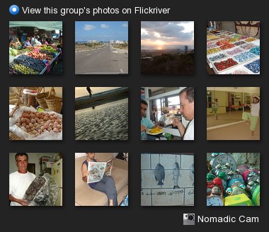
Today's paper - "7 Days" - July 27 2007Ami Ben Basat – a journalist, a writer and a friend has started an amazing project – he sent his miniature Sony T7 camera on a photo-journey. Each week, this jewel of a camera spends a week with one photographer documenting his or her life and afterwards it’s passed on to the next photographer in the chain.

All the photographs are uploaded to Flickr and create a living documentary of camera’s travels.

In Ami’s own words:

This Friday I’m going to hand the camera to my friend Y. That’s where the T7’s unusual journey will begin. Y, who’ll be the camera’s new custodian, is an amateur photographer among other things. On Sunday he’ll take his own picture with the camera, along with a clip from that day’s newspaper. He’ll upload the picture to Flickr. It doesn’t matter where, provided that he does one thing: upload all images under one tag: “katze-blog”. That way, anyone who wants to see the pictures can key “katze-blog” in Flickr’s search engine and join the photo journey. That’s all.

Photo journey? Exactly so. Y isn’t going to keep that amazing camera. Instead, he’ll hand it on with the box (and this text) to a certain friend. Now the story starts over. Whoever gets the camera can keep it for a week. On Friday they have to pass it on. But before they do that, they’ll upload to Flickr (katze-blog) at least one picture of themselves with a newspaper and a date, and several others – all of them taken by this little naughty camera. They should not forget, of course, to put them under the appropriate tag so that we can all see it.

And on Friday they’ll hand this little treasure to a new user.

Ami’s post announcing the Nomadic Camera Project can be found here.

I was very fortunate to be the third one in the chain to get the Nomadic Camera – after my friends Yaniv Golan and Amit Knaani.

You can see the Nomadic Camera photos I took so far on Flickr and on Flickriver. All project photos are added to the Nomadic Cam group pool that also has its own Flickriver view.

Nomadic Cam - View this group's photos on Flickriver

I’m really looking forward to following the Nomadic Camera travels – first here in Israel and then, hopefully, all over the world.

—————-
Now playing: Bob Dylan – Like A Rolling Stone
via FoxyTunes

Iosart.com latest additions or how much has changed since 2004

July 23rd, 2007

Iosart.comMy site was in a desperate need of an update. Basically, I had quite a lot of stuff laying around the site, without any consistent navigation to lead to it.

So, I added a new top navigation toolbar to every page on the site with links and menus that directly lead to almost any piece of content available on Iosart.com. Also, I moved some stuff around and created a new front page which is now more dynamic and lightweight.

Doing some work on my website got me thinking about the technological choices I made back when I first created it versus what I’d use today, if I had the chance to start things from scratch.

Iosart.com website dates back to early 2004, when I realized that I need a place where I could post some of the stuff I was doing – my photos, plugins, articles and so on.

It’s interesting to compare the technologies I used back then with what is considered the state of the art today


  • My initial site was written in static HTML with some Server Site Includes for templating. Today, I would definitely be using PHP for everything
  • I wrote my photo gallery system called KPSS in Perl. Again, today I would definitely use PHP for stuff like that. Better yet – today I’d use the Flickr API to create my own view on my Flickr photos. Bear in mind that in 2004 Flickr was still in its infancy…
  • My blogging software at the time was NucleusWordPress wasn’t yet the undisputed king of blogging platforms.
  • I posted some of my academic papers as raw PDFs . Today, I’m posting such things to Scribd and then I can take their widgets and put a document on my site in a nice doc viewer widget.
  • I had “Links” page where I manually collected some of my mostly used links. Again, del.icio.us and other social bookmarking services still weren’t very common. Today, it really makes more sense to manage everything in some bookmarking service and show the most common links on my site using a widget.
  • Finally, I had some pages with tutorials and I wanted to allow people to add their comments or questions. Because I wasn’t using any CMS (Content Management System), I created my own script that allowed adding user comments module to any static page. Today, I’d just use a WordPress based page for this, which would also solve the terrible spam problems I experienced during these years.

In fact, today I’d seriously consider basing my whole site on WordPress. Beyond blog posts, WordPress allows creating custom ‘pages‘ which can optionally have comments, their own custom templates and so on.

Anyway, it’s really interesting to see how much has changed in only three years. New “best of breed” tools and services have emerged – Flickr, del.icio.us and WordPress are only a few examples. Things are getting better all the time with services such as Ning, Amazon EC2 and S3 and many others.

Now, one can really focus on the content instead of infrastructure. And, once the infrastructure becomes a non-issue, the creativity can really blossom.

Announcing Flickriver – my latest project

July 1st, 2007

FlickriverI love Flickr. I use it almost daily – I post my own photographs and view photos my friends are posting. I search Flickr for specific locations, events, objects or people. Sometimes, I explore Flickr and discover amazing pictures and great photographers.

I think Flickr has great user interface, but after using it for a while I could think of quite a few things I wanted to add, tweak or just do a bit differently.

Enter Flickriver – my latest personal project. It’s new website that offers a different approach to viewing and exploring Flickr photos. Basically, it encompasses several of my ideas for how Flickr viewing experience could be enhanced. As I said, I’ve been thinking about these ideas for a while now, so I used the recent holiday to go ahead and implement some of them using the Flickr API – and this is how Flickriver was born.

Here are a few examples of what Flickriver offers:

  • River of photos view – on Flickriver, the photographs are always displayed as one continuous stream – you can view thousands of photos without ever needing to hit ‘next’ and waiting for the next page to load! This is also known as “infinite scroll”. I noticed that with paged interfaces, I’d typically see a page or two of any specific view and then give up and move on to something else. With “river of photos” I can see much more photographs, or even all photographs in a view, quickly and conveniently. For an example, you can see the most interesting photos stream from a couple of days ago
  • Large images – I believe that size really matters when you truly want to appreciate the beauty of photography – thumbnails just don’t do justice to many photographs, making it so much easier to miss a great photo. So, all photographs in Flickriver streams are always displayed in large size.
  • Black background – I believe that most photographs just look much better on black. I think that the photograph (and not the background) has to be the brightest thing on the page – this really makes great photos “pop out” and look even more beautiful.
  • User most interesting photos – when I stumble upon a new Flickr user, the only view I get on Flickr is “user’s most recent photographs”. But what if the most recent photographs are not very good, while other, older photographs, are really outstanding? How can I discover these great photographs? I believe that “user’s best photographs” is a very important view for discovering and exploring users. Flickriver adds “user’s most interesting photos” view, allowing you to quickly see user’s best work. Check out my most interesting photos for an example.
  • Photos of user’s contacts – this is an additional Flickriver view not available on Flickr. Basically, Flickr can show me what my friends and contacts are posting. But what if I want to see what the friends of my contacts are posting? This additional Flickriver view is a great way to discover new people and photos through other people. For an example, you can see photos from my contacts here.
  • Most interesting Pool photos – similarly to user views – Flickr only shows the most recent photos added to any given group pool. Flickriver allows you to also see the most interesting photos in any pool. Here is an example for the 24 hours of Flickr project pool.
  • Keyboard navigation – when viewing a Flickriver stream, you can press j/k to go to the next/previous photo. Hitting space also allows quickly jumping to the next photo. So, you can quickly go over many photographs with Flicrkriver just by pressing space and going through the pictures one by one. When you’re using keyboard for navigation, Flickriver adjusts the view so only one photo is visible at any given moment.

These are just a few of the things Flickriver enhances. Beyond that, Flickriver has many additional Flickr photo views – user recent photos, favorites, sets, user and everyone’s photos by tag, everyone’s most interesting and recent photos, group and pool photos and much more. Also, Flickriver follows the Flickr URL structure as much as possible, so you can easily go back and forth between the two.

I added several tools and extras to enhance Flickriver – you get a link creator that allows you to quickly create a link to any Flickriver view and post it on your site and there’s a mini-Flickriver widget that you can embed on your Webpage. There is a bookmarklet and a Greasemonkey script – both allow you to quickly jump from any Flickr page to the corresponding Flickriver view. Finally, there are ‘share’ buttons that allow you to post any Flickriver view to StumbleUpon, Delicious, Digg and Facebook.

That’s it for now, I hope you enjoy Flickriver as much as I do :)

The Art and Science of Photography

June 22nd, 2007

Milk Drop CoronetQuite a few years ago, during my undergraduate studies, I took a course named “Science in Art”. The course explored various scientific subjects such as light and symmetry as reflected in famous paintings, sculptures and other artistic creations.
For my final course paper I decided to explore both artistic and scientific aspects of photography. I did quite a bit of research for the paper and learned a lot in the process. Anyway, the paper was lying on my hard disk for years and I thought this might be a good time to share it.

The paper is called “Photography – a new art or yet another scientific achievement“. Here’s an overview of the main topics:

Install Google Gears in a XULRunner app in 3 quick steps

June 5th, 2007

BoltzAs I mentioned in my previous post, I’m now using Google Reader in WebRunner as my main RSS aggregator.

A few days ago, Google released Google Gears – it’s a browser add-on that allows various Web apps to work offline by providing them with ways to store and retrieve information locally. As one of its first implementations, Google Gears allows Google Reader to work offline.

While Google Gears installs and works seamlessly with Google Reader in Firefox, there are a few things that need to be tweaked in order to make it work in WebRunner or any other XulRunner application. The actions below are somewhat Windows specific, but something very similar can be done on any platform.

  1. Register as a global extension – by default, Google Gears installs itself as a Firefox global extension in Windows registry:

    [HKEY_LOCAL_MACHINE\SOFTWARE\Mozilla\Firefox\Extensions]
    {000a9d1c-beef-4f90-9363-039d445309b8}=C:\\Program Files\\Google\\Google Gears\\Firefox\\

    In order to add it to WebRunner we need to add the following key to the registry:

    [HKEY_LOCAL_MACHINE\SOFTWARE\WebRunner\Extensions]
    {000a9d1c-beef-4f90-9363-039d445309b8}=C:\\Program Files\\Google\\Google Gears\\Firefox\\

    The exact registry path is different for every XulRunner application, but the basic structure is “HKLM\Software\VENDOR\APP_NAME\Extensions”. In WebRunner case there is no “Vendor”, so it’s just “HKLM\Software\APP_NAME\Extensions”.

  2. Add WebRunner compatibility to Gears manifest. Locate the Gears extension manifest install.rdf file (typically in C:\Program Files\Google\Google Gears\Firefox), and add the following lines:

    <em:targetApplication>
    <Description>
    <em:id>webrunner@webapps.org</em:id>
    <em:minVersion>0.1</em:minVersion>
    <em:maxVersion>10.0</em:maxVersion>
    </Description>
    </em:targetApplication>

    “webrunner@webapps.org” is the ID of your WebRunner XulRunner application. For other XulRunner apps, you can find out the correct ID in their application.ini file.

  3. Add Extension Manager support to WebRunner. Locate the main WebRunner application manifest file – application.ini (typically found in C:\Program Files\WebRunner) and add the following lines:

    [XRE]
    EnableExtensionManager=1

Basically, the first step makes sure that WebRunner detects the extension, the second one makes Gears compatible with WebRunner and the third makes WebRunner load the Google Gears extension. Once you complete these three steps, Google Reader and any other supported Web app will detect and use Google Gears for offline functionality.

WebRunner or How Google Reader became my main RSS aggregator

June 5th, 2007

The BookI’m an RSS junkie. I go over nearly 200 feeds every day – news, industry updates, my friends’ blogs, flickr photos and so on. That’s why my RSS reader has become the second most important application for me, after the browser.

The problem

I used SharpReader and RSS Bandit and encountered very similar problem with both of them. Once the number of feed items starts to grow (I hate deleting old items), so does the memory and CPU consumption. Last time I looked before uninstalling, my SharpReader used 800Mb of memory. RSSBandit would use 100% CPU for minutes…

Additionally, because I use at least 3 computers almost daily (home/office/laptop) – synchronizing my feeds between all of them was very cumbersome, if not impossible with these apps.

Google Reader? A few problems still…

Enter Web based RSS readers. I tried both Bloglines and Google Reader in the past, but something in their interface just wasn’t working for me. The latest version of Google Reader introduced a truly convenient Web RSS reading experience but I still couldn’t use it. Why? Here’re several reasons:

  • Developing, testing and installing extensions requires constant browser restarts. Having to open Google Reader each and every time is just not very convenient
  • Having Google Reader open requires being logged in with my Google login. This has several downsides – first, I often use different logins for different Google apps – Gmail, Analytics and so on – and logging in with a different user in some Google app kills the Google Reader login as well. Then there is the privacy concern – I search using Google tens if not hundreds times a day, and I just prefer to do it while not being logged in with my Google credentials. Being logged in into Google Reader obviously means I’m logged in when searching and basically everywhere.

The solution

To solve this problem I thought about ways I could create two separate ‘spaces’ – one would be my browser space in which I could be logged out from Google and periodically log-in into various Google apps, and a ‘Google Reader’ space in which I would be constantly logged in into Google Reader.

It occurred to me that XulRunner would be a perfect candidate for this. I thought about creating some custom solution using XulRunner, but then remembered that Mark Finkle has already created something very similar – WebRunner. Basically, it’s a ‘Site Specific Browser’ a simple XULRunner program that displays a single Web application in a simplified interface.

Here’re a few advantages of using Google Reader in WebRunner:

  • Completely solves Google login problems and my privacy concerns. I’m always logged in into Google Reader in WebRunner, and logged out in my Firefox
  • WebRunner being a separate process means that my Google Reader is always running like a regular desktop application, and obviously survives browser restarts
  • It has minimal UI that fits perfectly for Google Reader and similar Web apps – there is no need for ‘back/forward’ buttons, browser toolbars and so on. So almost all the screen real-estate is allocated to the Web app, and there is no unneeded and distracting UI elements

So, with the help of WebRunner and XulRunner, Google Reader has become my main RSS Reader. I get all the advantages of a desktop RSS reader and all the conveniences of a Web app – synchronization across machines, performance, storage and so on.

A few quirks

There are still a few disadvantages to using Google Reader over a desktop RSS reader:

  • No ‘new items’ alerts. Desktop readers can show an alert window once new items are published. While there are extensions that can accomplish something similar with Google Reader, their functionality is still fairly limited.
  • No search – I know, this is very ironic, but Google Reader still has no search functionality that would allow me to search within feeds.
  • New item delays – it can take Google Reader several hours to display new items after they are published. I really hope Google would solve this one.

Conclusion

Overall, I’m really enjoying my transition to Google Reader and would really recommend checking out WebRunner for this.

A young Freddie?

May 22nd, 2007

I heard a new song on the radio and for a second there it sounded like Freddie Mercury is a alive…

A short search revealed Mika – a young British artist with a pretty impressive voice

Mika

Mica Penniman (born 18 August 1983), also known as Mika (IPA [ˈmikə]), is a Lebanon-born, London-based singer who has a recording contract with Casablanca Records and Universal Music. Some sources note his birth name as Michael Holbrook Penniman. more…


Mika – Grace Kelly

[via FoxyTunes / Mika]

Spam, discussions and closed comment threads

May 19th, 2007

Did you ever want to comment on some great Blog post you found only to discover that the post is a bit old and the author has already closed the comments – so no new ones can be posted? I often do and I find this issue rather frustrating…

The reason for closing comments is pretty straightforward – spam. Each Blog post that accepts comments is a target for spammers – so the more such posts you have you’re increasing the amount of overall spam your blog receives every day.

Freedom...

A common strategy for dealing with comment spam is to close comments on older posts – after two weeks, a month etc. Which brings us to the original problem – closing comments on older posts prevents future discussions, even if those would really make sense long after the post was published.

Imagine yourself browsing Flickr and finding a great photo. You want to tell the author how great the photo is or ask a question, but you discover that the photo was uploaded two months ago and the comments are already closed! I couldn’t imagine such a scenario, because more often than not I discover photos long after they have been uploaded and I often see discussions go over long periods of time, being re-newed etc. – which is great. Unlike discussing some current events, discussing photographs cannot really be limited to a short period of time.

Many Blog posts are exactly like that, IMHO. People often search the Web for a specific topic and find old, but still relevant blog posts, and there is absolutely no reason, other than spam, not to allow the discussions on these posts to keep going.

My suggestion – a simple two-level comment protection system. Comments can be open or closed, exactly as today, but a third state can be introduced – let’s call it ‘protected’. In this state, posting a new comment is still possible, but more difficult – protected by CAPTCHA, verification via email etc. Now, after two weeks, instead of closing the comments, they can be set to ‘protected’ mode – this allows minimal barrier to commenting initially, while allowing valid conversations about the post to continue forever.

Italy posted to Flickr – India’s next

May 18th, 2007

I’ve finally finished working on the photos from my 2001 trip to Italy and uploaded them to Flickr.

Grand Canal

Next are the photos from my trip to India, Nepal and Thailand in 2000. I have more than 1,200 photographs from that trip, out of which I’ll need to select the best ones and post them to Flickr. The process will probably take quite a lot of time, but I’m excited to be starting it, because it will allow me to re-live this amazing journey.

Here’s a photo from this trip, taken on a busy Delhi street:

Street Child